With the exception of their logo, brand elements were sparsely found in existing content. While this didn't necessarily detract from their content due to the minimalist style of their branding, expanding their design system to apply across various channels (YouTube, Instagram, etc.) would make the brand much more cohesive and instantly recognizable, distinguishing them from other creators in the space.
Scooped.Bar offers genuine, passion-driven content as a keyboard enthusiast and involved member of the community. They’re deeply in tune with the concerns and preferences of their fellow hobbyists, who tend to be a generally sophisticated demographic that also enjoys creative office/desktop customization and clean visual design.
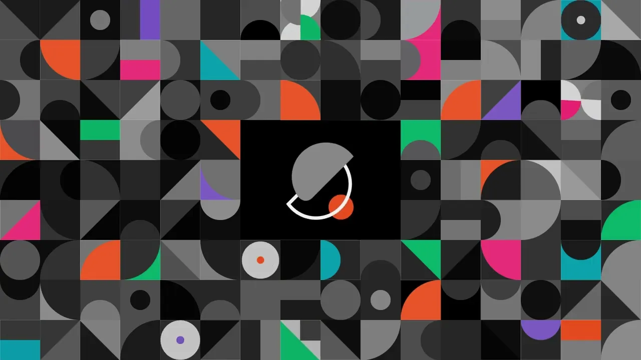
I chose to use the colourful geometric grid as a central element due to its immediate visual impact and versatility for motion design. Because the brand adheres to a fairly minimal design language, its motion design should also be simple and straightforward to avoid distracting from the main content. Elements should move following the same lines as the geometric shapes: repetitive arcs, linears, and 45 degree angles. By making use of anticipation, follow throughs, overlapping actions, simulated weight, and timing, we can still create visual interest with our animated elements.


The final product adapted hallmarks of the Bauhaus movement to implement purposeful animation, mirroring the values that Scooped.Bar’s brand also embodies: form over function, careful craftsmanship, and stylish minimalism.
Creative Direction, Motion Design