Over the last 8 years, the annual CAMK meet-up has evolved into the largest mechanical keyboard meetup in Canada and one of the largest on the continent, notably hosted and organized by volunteer members of the community rather than by a manufacturer or corporate vendor. However, its visual identity hasn't kept pace. As it grows, the challenge for the CAMK brand is to close that gap without crossing over into an overly-polished corporate presentation that would alienate its grassroots origins.
The event is still run by volunteers and funded on a tight community budget. As a result, a gradual evolution of the brand made more sense than a full design system refresh. More than that, it needed to be built for handoff, necessitating a focus on re-usable assets, freely available typefaces, and simple enough that a non-designer could make updates or variations without breaking anything.
The CAMK meet-up has always been hosted in Toronto, but we wanted the branding to easily accommodate application to other smaller meet-ups within Canada (Ottawa, Vancouver, Montreal, Calgary, and more) to bring the Canadian community underneath one umbrella. The brand needed to carry Toronto's influence as a foundation without encoding it so deeply that expansion felt like an afterthought or a franchise.
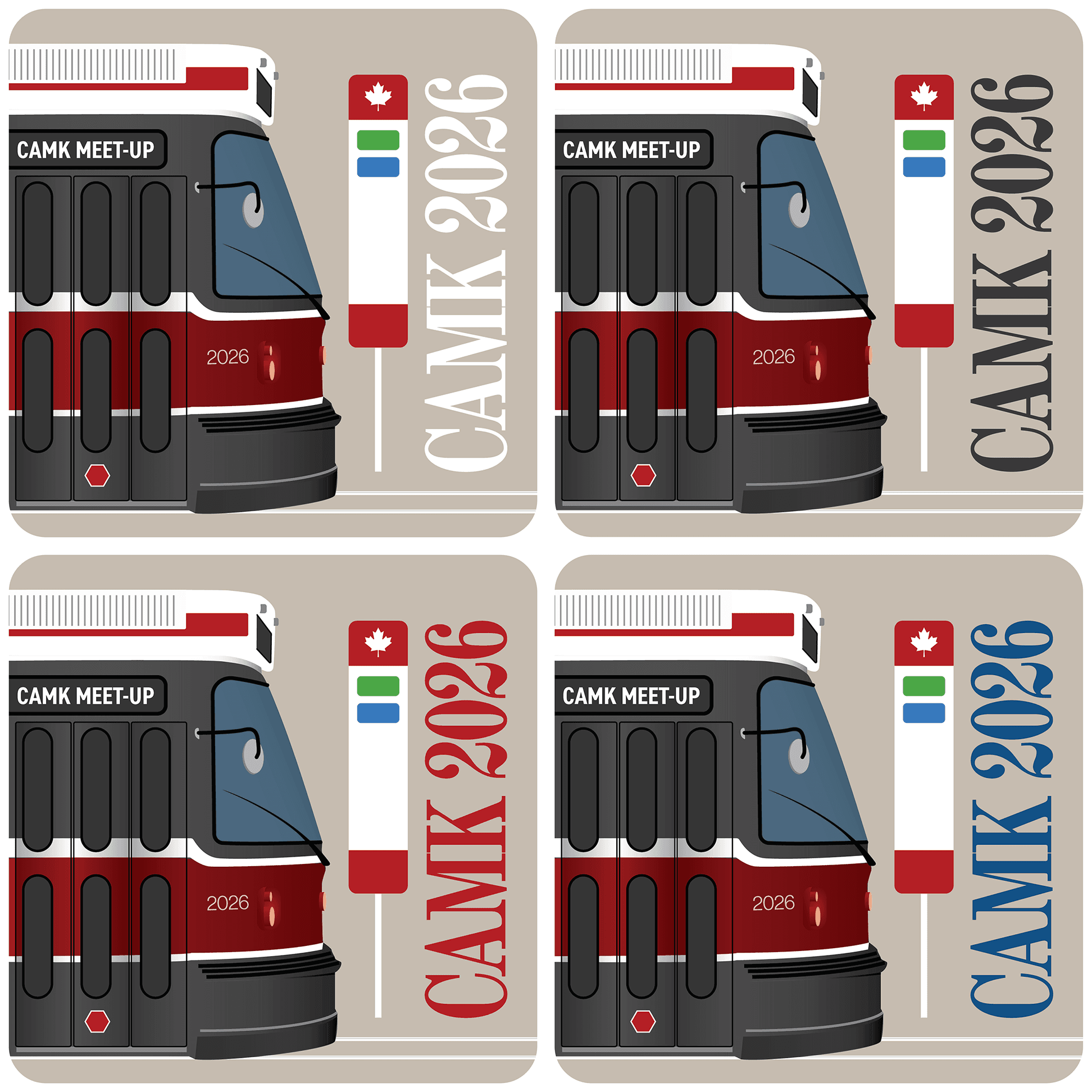
Below, the top left image (CMK 2025 Fall) represents an illustrated sticker design I created for last year's annual meet-up. The community chooses a sticker design (submitted by community members) by popular vote, and these are then distributed on entry to event-goers and serve as a handcrafted souvenir. Many hobbyists collect stickers not only from meet-ups around the world, but from vendors, artisan keycap creators, and other brands around the community - a fitting starting point for a brand refresh.


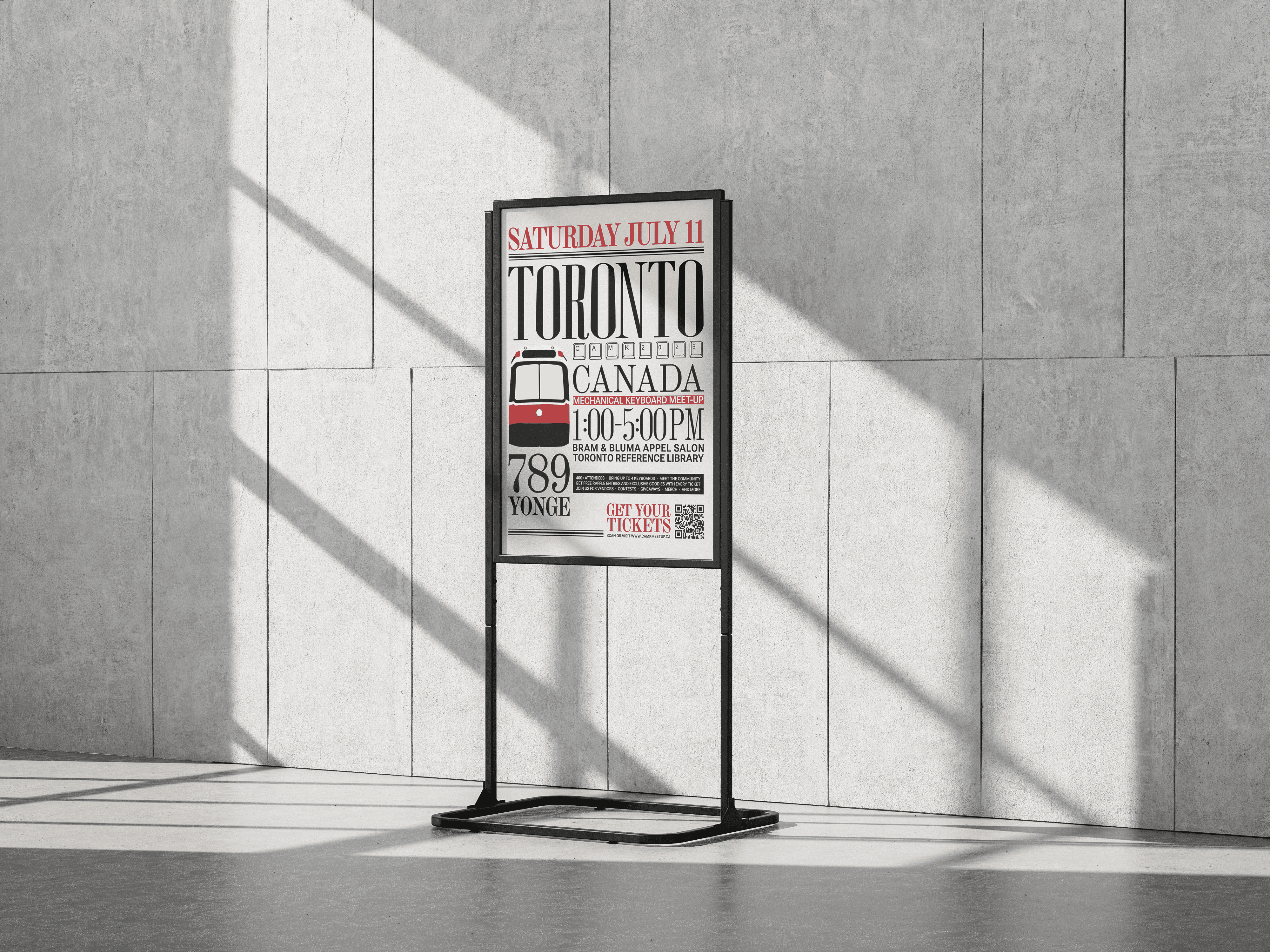
Part of the appeal of keyboard meetups is that they're genuinely open. You can come with a $40 board or a $4,000 build and nobody checks your credentials at the door. The visual identity needed to carry a sense of occasion and permanence without implying exclusivity. Choosing visual references like the TTC and the Globe and Mail — recognizable and ubiquitous Toronto institutions that feel significant but not elitist — was a deliberate answer to that tension.
The toned down, neutral palette of the poster reflects the popularity of similar colour schemes (beige, monotones, and occasional accent colours) throughout the hobby space, whereas the vibrant set of stickers with varied backgrounds were chosen as this year's meet-up is hosted during the summertime.
An additional poster designed for print and socials expanded the presence of the new branding, signaling it as an intentional pivot rather than a temporary theme that may change by next year.
Concept, Design & Creative Direction, Branding & Identity